A new front door for One Family Church
What onefamily.church looked like before, what we changed, and the thinking behind it.
One Family ChurchLaunch
Written with Claude Opus 5.5
One Family is a multiethnic church in Apopka, and the people are the whole point. When someone finds the church online, we wanted the first thing they feel to be what it's like to walk in on a Sunday morning.
Where it started
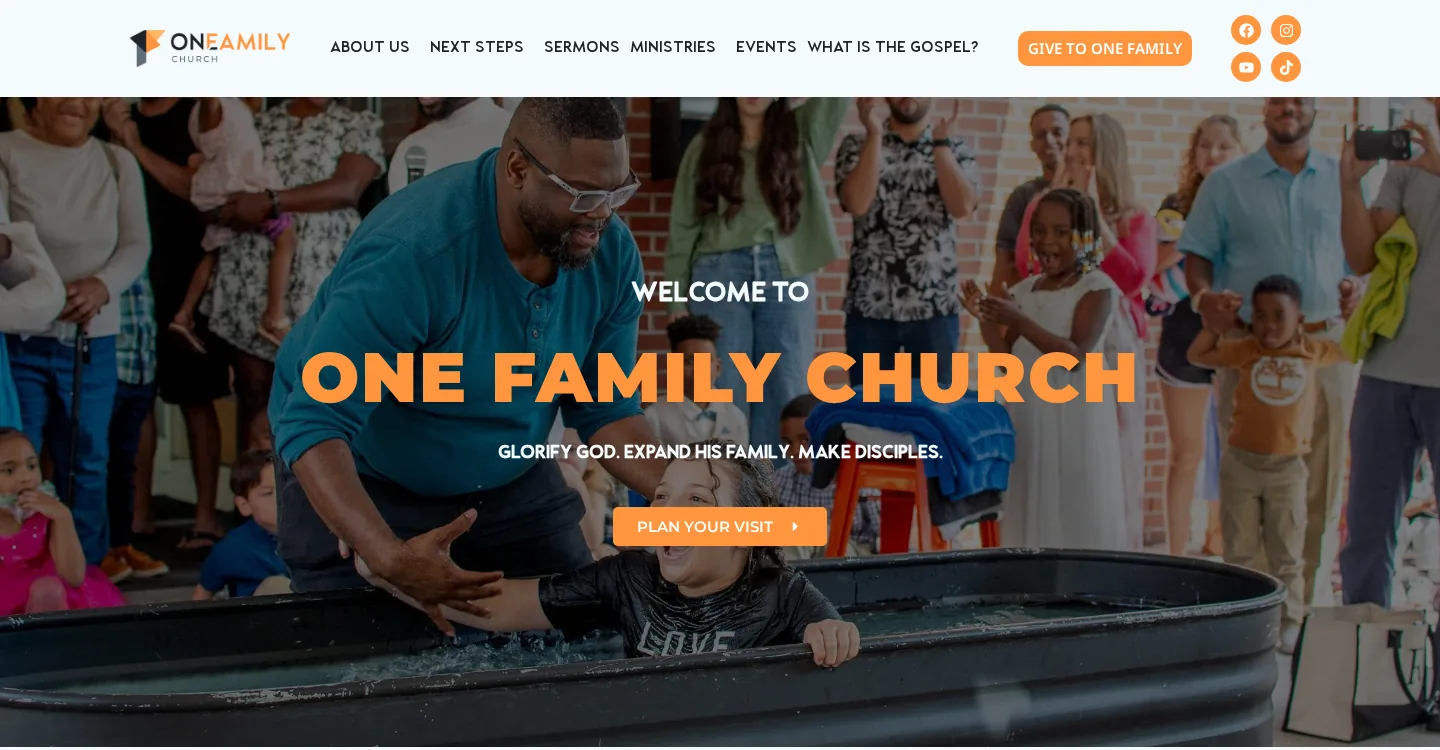
The old site did its job. It had the service times, a way to plan a visit, and the latest sermon. But the first thing you saw was a darkened slideshow with the church's name in big orange capitals over it. It said welcome, but it didn't show you anyone.
A real front door
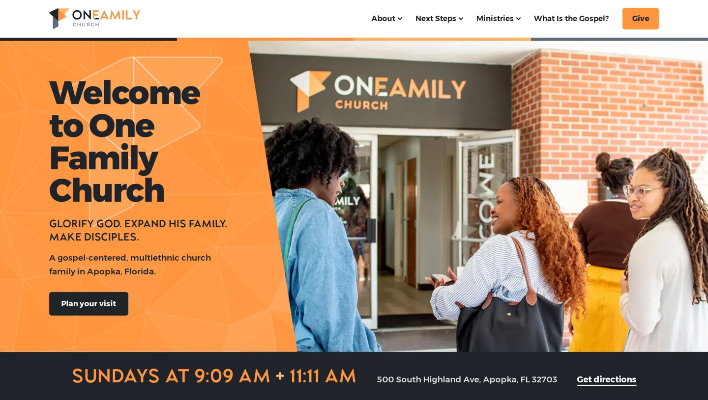
So the new homepage opens on the actual front door of the church, with people walking in. The welcome sits right next to them, and the service times sit right under it, so the two things people want to know first, who these people are and when to show up, are answered before you scroll.
The glass doors at One Family have a pattern of thin triangle lines on them. We traced that pattern and used it behind the headline, so the orange panel and the photo feel like the same place. As the page loads, the lines weave in, and four big triangles drift in and settle into the One Family mark. Here it is on its own, running the same code as the real site.
It is family
One line from the old site carried straight over, because it's the heart of the church: "The church is not like family. It is family." Before, it sat on a banner over a dark photo.

Now it sits next to the One Family mark, built out of photos of the church family. Each facet of the mark holds one photo, tinted in that facet's color, and every few seconds one facet swaps to another face from the church. A script finds the faces in every photo and only uses one where every face fits whole, so nobody gets cut in half by a triangle.
The church is not like family. It is family.
A header that fits each page
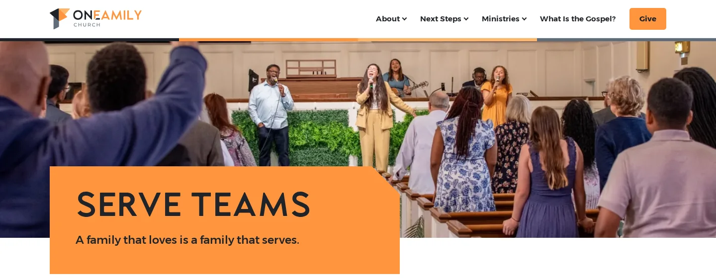
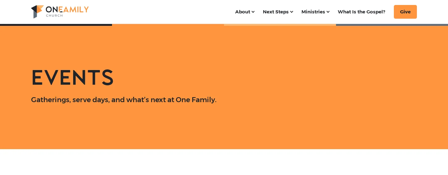
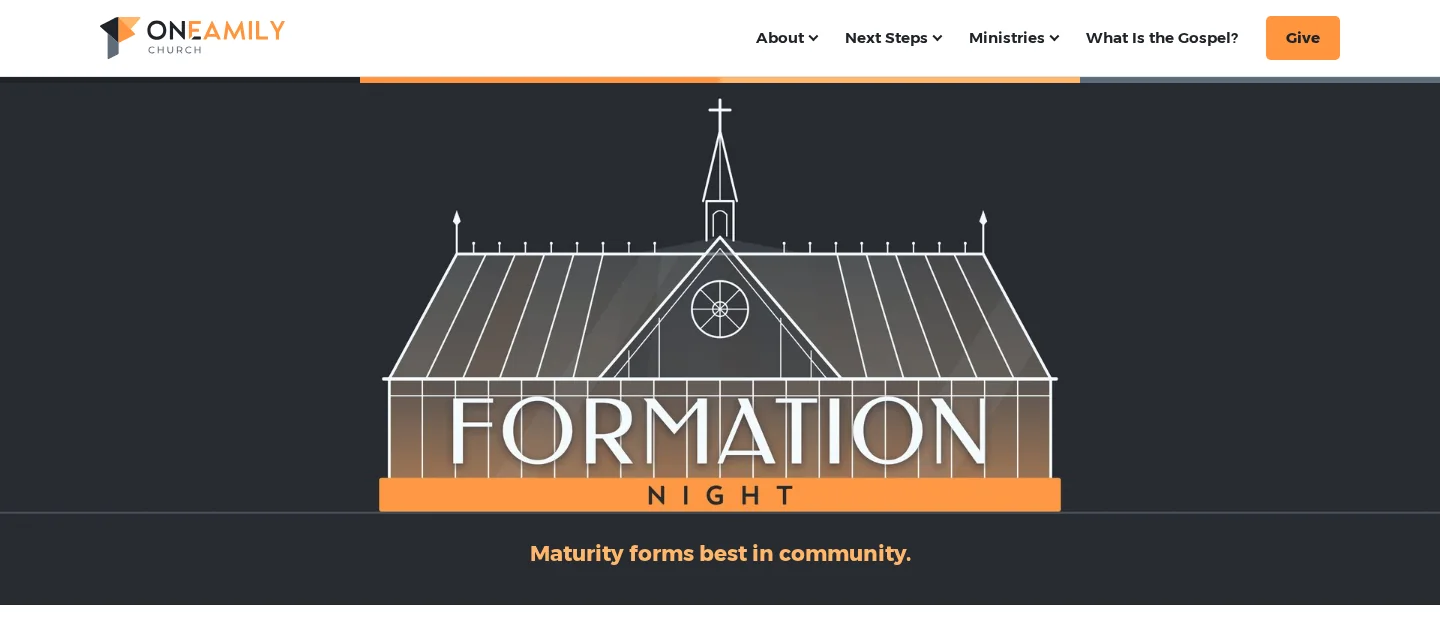
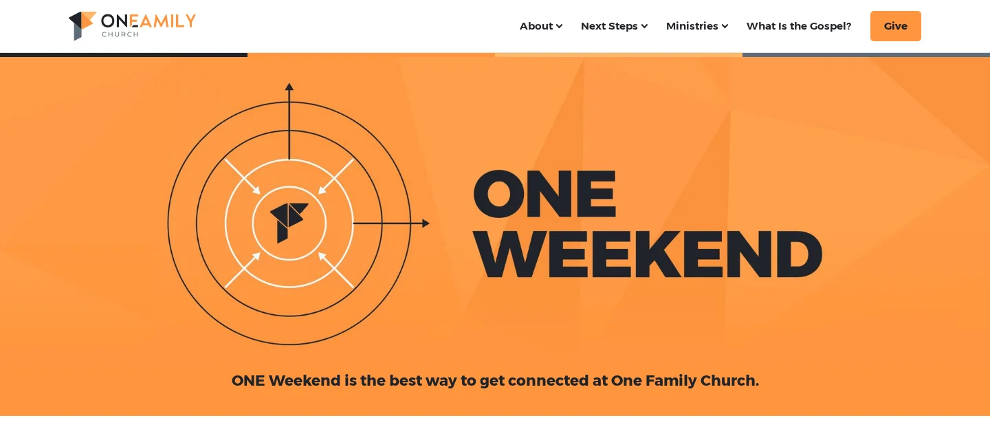
Every color on the site comes from the One Family logo, so it all feels like one church. Each page then opens one of three ways, picked for that page. Some show the ministry itself, like the worship team on Serve. Some open with the ministry or event's own graphic, like Formation Night and ONE Weekend, the same art people know them by at church. And some, like Events, get a simple band of the church's orange, because the page is about what's below it.
A site that keeps itself current
On the old site, the latest sermon was one video someone had to swap by hand. Now the newest sermon shows up on its own from YouTube, and events come straight from Planning Center. When the staff add something in Church Center, it's on the website. They don't have to remember a second place to update.
Then we stayed
The site went live on October 16. Since then we've kept going: new slides for Sunday mornings, signs for the tables and pews, and plenty of small fixes. That part matters to us most. A launch is one day. Looking after it is every week after that.